
I came across Stacy’s blog through Monochrome Madness Challenge. It seems it all runs in circles, but I was lucky enough to jump into a good circle, with so many wonderful people. I joined her AfterBeforeFriday Forum around 7th or 8th week, but nevertheless I celebrate this one year anniversary with all my heart. Six months ago, we implemented One Focus Photo feature and it has been a huge success.
So, we have two anniversaries today – One year of ABF Friday and Six months of OFP. It is only fitting to mark it with one of Stacy’s photos. When I saw the photo, I knew it would be a monochrome version. Seems I am not alone, if you check the gallery on her blog, quite few of the participants went the same route.
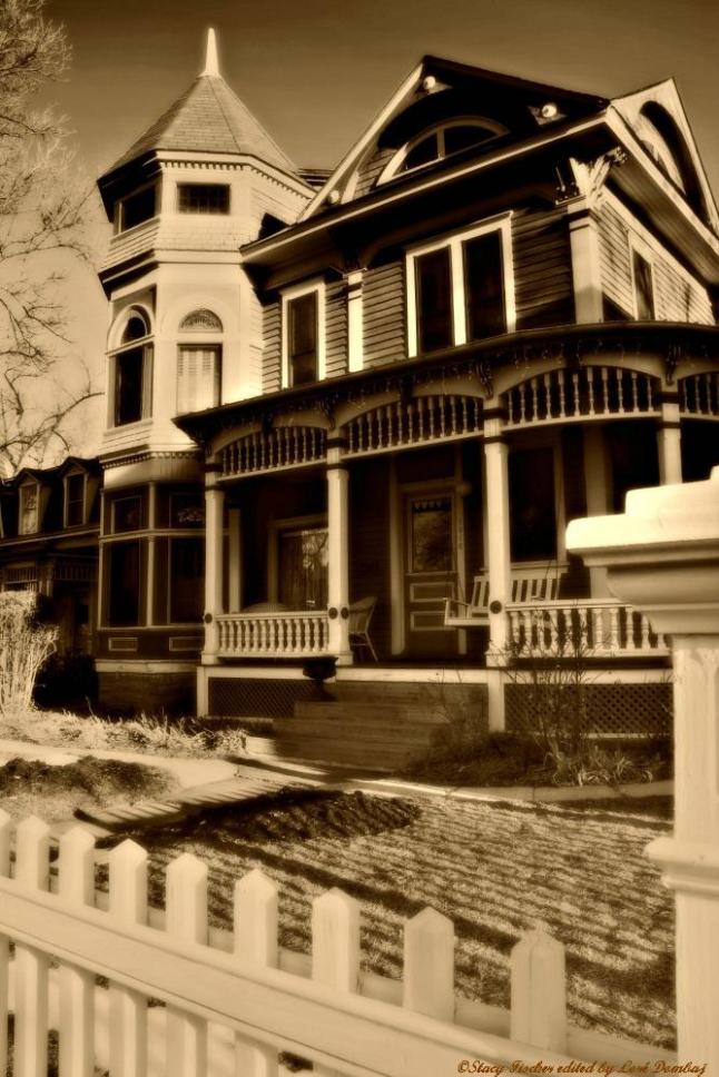 I call this image “Low Winter Sun”, although I had no idea what season it really was. I was right, because the image was taken this February. Stacy presented us with quite a challenge, because of the contrast between those dark and light parts. It was hard to find a balance, but the monochrome just whispered to me in the right way. And naturally, I had to flip the image.

Please, hop to Stacy’s blog Visual Venturing and see how it’s really done.
I leave you with some of my favorite afters from the first year of AfterBeforeFriday and hope there are many more to come.

Week 1

Milan, Italy

Little Wanderer

The Princess and the Pea

Like the Tick, Tick, Tock of the Stately Clock…

Strech You Sails And Sail Away

O Minion, Minion! Wherefore art thou Minion?

S tuck in Time

Pearls

Berta

Night and Day

Merry Christmas

Fly me to the Moon

Charging

My One Photo Focus

Lazy Afternoon

Memento

Nostalgia

I love that tone, great job.
LikeLiked by 1 person
I knew there would be so many monochrome versions and they all work. Thank you, Mary.
LikeLike
nice idea to flip it!
LikeLiked by 1 person
Thank you, Laura!
LikeLike
You’re welcome!
LikeLiked by 1 person
What a cool way to celebrate Stacy Anniversary. I adore it.
I also like that you flipped the house. It seems to work well.
LikeLiked by 1 person
Thank you, Cee. I really enjoy being a part of ABF community.
LikeLike
Oh, Loré, what a wonderful way to celebrate the past year!! I wish I had thought of that 😉 I loved looking back at your images (and remembered every single one). I’m so glad you found ABF – you’ve been a stalwart supporter since the beginning, and I really appreciate it!
Now, as for your submission, I had to laugh that you did your signature Loré move and flipped it 🙂 Perfect timing for this. And, you’re right that the image definitely does work well in monochrome. I really like the sepia tone you gave it. Very fitting for an old Victorian house!
LikeLiked by 1 person
First of all, it’s been an amazing ride and I am so happy that we crossed our paths. Who knows, maybe one day we’ll be lucky enough to meet.
As for your image, once I started working on it I realized how awesome job you did by capturing all the lines. It just started to reveal itself to me, this trully excellent composition.
Thank you, Stacy! 😉
LikeLiked by 1 person
Fingers crossed about meeting 😉 and thanks for your nice comment about the composition!
LikeLiked by 1 person
What a great idea to show some of your Afters over the year, I wish I had thought of that! Berta is adorable!
Flipping the image around gives it a whole new feel. Nice job. 😀
LikeLiked by 1 person
I thought for sure some of you would do the same, show what we’ve been up to this last 12 months.
As I said it before, flipping was an afterthought.
P.S. Berta says Tnx! 😀
LikeLiked by 1 person
Lovely soft and dreamy Lore, and a nice twist with the flip 🙂
LikeLiked by 1 person
Thank you, I am happy you liked it. I love all the lines and blocks in this image, I think Stacy did a good job.
LikeLike
As others have said it is a nice and soft image. The black and white with sepia and the flipping of the picture really makes it stand out. The blacks for me feel a bit crushed but i think that is also intentional. In all I think it is good edit.
LikeLiked by 1 person
Thank you, Ben. I went for a little bit of a burned, old photo feel. Flipping was just for fun, I don’t know if it really adds anything. But I couldn’t help myself. 🙂
LikeLike
love the old look of that image you have given it and a great gallery Lore!!
LikeLiked by 1 person
I got that old vibe from the first look. Thank you.
LikeLiked by 1 person
Works very well in black and white, and I like the fuzzy look to it, its very effective in creating that nostalgic feel and your signature flip effect of course! I’m now repeatedly kicking myself that I didn’t think of putting together a “best of” ABF gallery, an inspired idea and really nice touch. 🙂
LikeLiked by 1 person
I just can’t believe nobody thought about the gallery, but me. I would love to see others work displayed in one gallery. Well, you can always do that for this week, when we are taking a break from ABF.
Thank you for your kind words, I can’t believe I have a “signature move”. 😀
LikeLiked by 1 person
That is a great idea Loré. 🙂
LikeLiked by 1 person