On this month’s One Photo Focus 25 photographers are sharing their post-processing interpretations of one “before” image submitted by Manal Ali of A Single Shutter.
When I finish editing a certain image, I think to myself: Not bad, not bad at all. And that works well when I am the only one editing that image. But when other 24 people post their versions of the same image, then I think to myself: Oh my, I really failed this time.
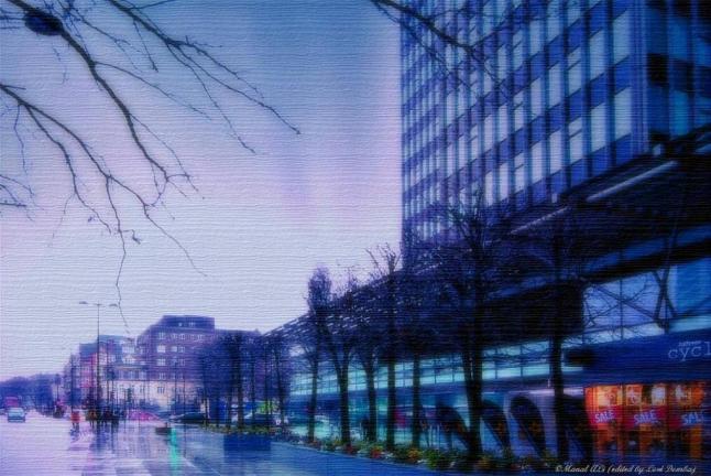
It started promising. Using GIMP, I straightened the image and that worked well. Adjusting the exposure and colors was another easy part, I knew from the start I wanted to have a very colorful image. But then came the hard part – dealing with the sky. I tried many different things, ending up with this version. The sky was still overblown, so I added the texture to tone it down. I don’t like it, but sometimes you just have to let it go.
This slideshow requires JavaScript.
Next month our merry old band works on my image, which I still have to choose. It is a daunting task and it gives me far less pleasure than I thought it would. But, I’ll figure it out.
In the mean time, if you’d like to join us in ABF’s One Photo Focus or our regular shenanigans, you need to hop over to Stacy Fischer’s blog Visual Venturing, where you can check all the details and other versions of this same image. Looking through the gallery, I am blown away by some of the other versions, especially Ben’s from Aperture64. What an imagination.
Hope you have a great weekend.


I like the texture, that really gave that photo a different look.
LikeLiked by 1 person
Thank you, Mary, The texture really helped.
LikeLike
Wonderful edit.
LikeLiked by 1 person
Thank you, Cee. 🙂
LikeLike
Interesting soft focus and texture.
LikeLiked by 1 person
Thank you, Lynne.
LikeLike
I like the idea of your process, possibly toning down the strength of the blue from the texture might have helped the image. Selectively editing the sky in this image was always going to be quite tricky and I like that you found a way around for you.
Nice Work.
LikeLiked by 1 person
I think my mistake was lack of patience. Once I figured out what I didn’t like, I was not patient enough to go back to the start, but tried to change the image that already had too much changes. Ah, well…You live, you learn. Thank you for stopping by.
LikeLike
Failed? I don’t think so, Loré. I love the beautiful watercolor effect! As Ben says, you found a great way to deal with the lackluster sky. And I love the textured look. You just keep right on playing and playing 😀 Can’t wait to see what you come up with for all of us next month! (No pressure or anything 😉)
LikeLiked by 1 person
Thank you, Stacy. I think I have an image for the next month, I’ll sit on it for a while.
LikeLiked by 1 person
Great edit Loré, I really like what you have done with this, the colours and texture have such a painterly effect and the overall blue tone with the orange in the corner helps to balance it. Looking forward to next months edit! 🙂
LikeLiked by 1 person
Thank you, Katie. Glad you liked it, the colors are the best part to me.
LikeLiked by 1 person
Lore I like it, I loved the use of the texture and the blurple colour toning. The sky was a lot of big bright empty space and I found it really hard to deal with too, so you are not alone there 🙂
LikeLiked by 1 person
Tnx, Stacy. The sky part was really challenging.
LikeLike
Lore, I have not read any of the comments you received but I am sure they are all positive. I love the texture and the blue wash you added. Sometimes you just have to stop second guessing yourself. Don’t worry what 23 other people will do and how yours will stack up- although I’m exactly like that. My desire is to blow everyone else away and be the best of the bunch. It hasn’t happened yet but I keep trying! 🙂
LikeLiked by 1 person
I know, I know…I am my worst critic, but I get over it. Thank you for your vote of confidence.
LikeLike
Lore, lovely edit and I really like the texture you added and colour tones. I had trouble with the sky also so put that in the too hard basket and left them alone just trying to bring the tower to life which had moderate success. It was a tough one that’s for sure. Cant wait until next month to play around with your photo 🙂
LikeLiked by 1 person
Thank you, it’s comforting to know I was not the only one having a trouble. Glad you liked it.
LikeLiked by 1 person
Lore – I agree with the comments above that you’re doing a disservice comparing yourself to the other photographs. We all did different things. As it is, you were quite creative in dealing with that sky and that was not easy! So you’d do it different the next time – that’s why we will never stop learning how to post process our photos. This one was outside my comfort zone for sure and I also have things I’d change if I were to redo it.
I did notice though as you replied to the comments that you seemed to get much more comfortable that you in fact did good job. I was glad to see that; I’ve done that too where I’ve really been critical of myself and my faithful commenters told me I was wrong. I’ve become much more accepting of my work.
Good job! Be proud of it!
Nancy
LikeLiked by 1 person
Thank you, Nancy. You are very kind and I truly appreciate your words.
LikeLike
I love the soft and moody finish. Great job and a creative approach. 🙂
LikeLiked by 1 person
Thank you.
LikeLike
I like the creativity and artistic image that is the end result – very different feel to the usual edit 🙂
LikeLiked by 1 person
Thank you, Manal. It was an interesting and challenging image to work with. That is always a good thing, because we tend to cross over our selfimposed boundaries.
LikeLike
The sky was a challenge to work with, the more I tried to push it the more it seemed to create weird colors and blockiness… I think you did a great job creating a soft painterly look that is emphasized by the texture you chose. Great edit. 😀
LikeLiked by 1 person
Thank you, it was a challenge to deal with the sky. The texture helped a lot.
LikeLiked by 1 person
I really love what you have done with this image, and I am busy working on the your image for the March post! can’t wait to see what you have done!
LikeLiked by 1 person
I can’t wait to see what you come up with. Thank you!
LikeLiked by 1 person