
Trouble…
Trouble, trouble, trouble, trouble
Trouble been doggin’ my soul since the day I was born
Worry…
Worry, worry, worry, worry
Worry just will not seem to leave my mind alone
Are you wondering what ever possessed me? Trouble, I say. I had so much trouble with this image, but stubbornly refused to give up.

It started promising, I cropped and strengthen the image, adjusted the brightness and saturation. And then I made a mistake. I clicked on that darn Orton. It gave the image a very soft, dreamlike quality. But I lost some details, especially on the door handles. I went back and forth, trying to bring back the details, while retaining the Orton effect. It just wouldn’t work.
I started from the beginning, went in completely different direction, but my eye was so drawn to the Orton version, I kept coming back. I usually save all the versions I make and then view them as a slide show. The one that speaks the most to me gets to be picked.
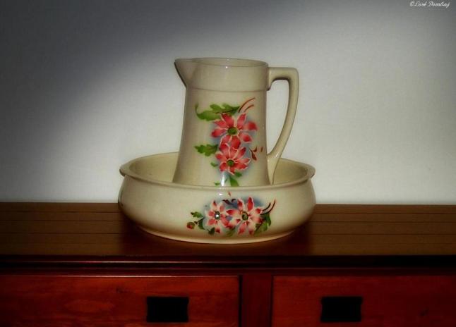 So, I decided to stick with my first choice and played a little bit more. Leanne Cole had an interesting post about observing the world when drawing and taking images. She made a great point how people sometimes forget to take into a consideration the natural ways of light and shadow when manipulating their images in post-processing.

I tried to see what would happen if I played around and added a soft background shadow. And now you can see how it is done in a wrong way. Because, if you look at the image logically, there is no correlation with the soft light coming from the right side and the actual shadow that the pitcher throws at the desk. But it is a nice exercise.


Great editing job. I like how you improved your original.
LikeLike
Thank you.
LikeLike
Great editing! I had to look at the original again to see the good work that gave a new look to the image after processing.
LikeLike
Thank you, Norma. After all the doubts, your words are very welcoming.
LikeLiked by 1 person
What a great difference from the original. I did like the one with a little bit of the table showing though. The color was nice. But the cropped close in is great!!
LikeLike
I love the glow of the final image. The so-called “shadow problems” don’t stand out at all; to me they are not noticeable.
LikeLike
I am so happy you saw what made it irresistable to me. As for the shadow, I wouldn’t have noticed if I haven’t read Leanne’s post.
LikeLike
The shadow issue was only noticeable once it was pointed out otherwise I would have been non the wiser. The soft approach seems to have worked to blur those details that were otherwise distracting around the jug. Good Edit overall.
LikeLike
Thank you, Ben.
LikeLike
Loré, this is a lesson in how to take a rather simple image and turn it into something much better. I do like the glow effect (never heard the term “Orton,” so thanks for teaching me that). I read Leanne’s post too, so I can see where you were coming from in wanting to add the light. As Ben and Robin have said, I wouldn’t have noticed the issue either (we are are own worse critics!) I like how you’re a dog with a bone, so to speak, as you edit. I am sooo that way too. Perfectionism: time-sucker 😉
LikeLike
Thank you, Stacy. This is one more image that people like more than I do. Just goes to show I know nothing. 😛
LikeLiked by 1 person
Really an improvement over the original, even if you’re not 100% in love with what you achieved. I don’t think I’ve ever used the Norton effect as it seems too much blur and too dark. But it looks like you backed off quite a bit with it and it seems to work nicely.
LikeLike
Yes, I toned it down qute a bit. You know how easy it is to go overboard. 🙂
LikeLike
The two bottom ones are both great. I like the detail and added shadow and I love your quotes!!! 🙂
LikeLike
Thank you, I am happy you like both versions. After all the positive comments, I might warm up to them, too. 😛
LikeLiked by 1 person